i was messing around in photoshop while looking at thoes userbar tutorials and came up with this.
what do you think?


i was messing around in photoshop while looking at thoes userbar tutorials and came up with this.
what do you think?


Hmm...might look classier if it were shorter, less space between the lines...
-Dave
Originally Posted by jdbnsn
The overall idea is good. You positioned the ATI logo well.That's a good sign. But even better is: you made a border! That's what so many people forget, a border is the finishing touch. Without it your image looks less "pro"... (My opinion)
Is that an Enermax Liberty? I'm planning on buying that one.
-That UPS guy delivered the wrong PSU. I'll teach him with my USP!-


Clean, simple, etc
i should make a tiny little bar to show my ATi fanboyness too =/
i5-3570k @ 4.40GHz // R9 380X @ 1020MHz // 2x Samsung 850 EVO SSDs // 2x 2TB HDDs
Fractal Design Define R2 XL "Monolith"
here is a slimer version that i made orignal should still be in sig
yes it is and i am very happy with itIs that an Enermax Liberty? I'm planning on buying that one.

I think its still a little big. You should trim it just a little bit more (height wise). Move the ATi logo in a bit and make it shorter.
You Dont Spread Democracy Through The Barrel Of A Gun.
Blend the colors a bit and it will look better. Also did you apply a stroke around the ati logo?
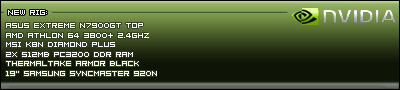
here is the latest rendition. i made it a bit darker with a fade and made the whole thing more streamlined. what do you think
with shine
without
also i just noticed i forgot the black stroke arond the edge i plan to include that in the final i just dont want to do another upload
I think thats a heck of a lot better! GJ!
Just one other comment however. You should lighten up the bottom just a tad so its easier to read what PSU you've got.
You Dont Spread Democracy Through The Barrel Of A Gun.
i think this is my favorite so far. (diffrent fade)
 Posting Permissions


 Reply With Quote